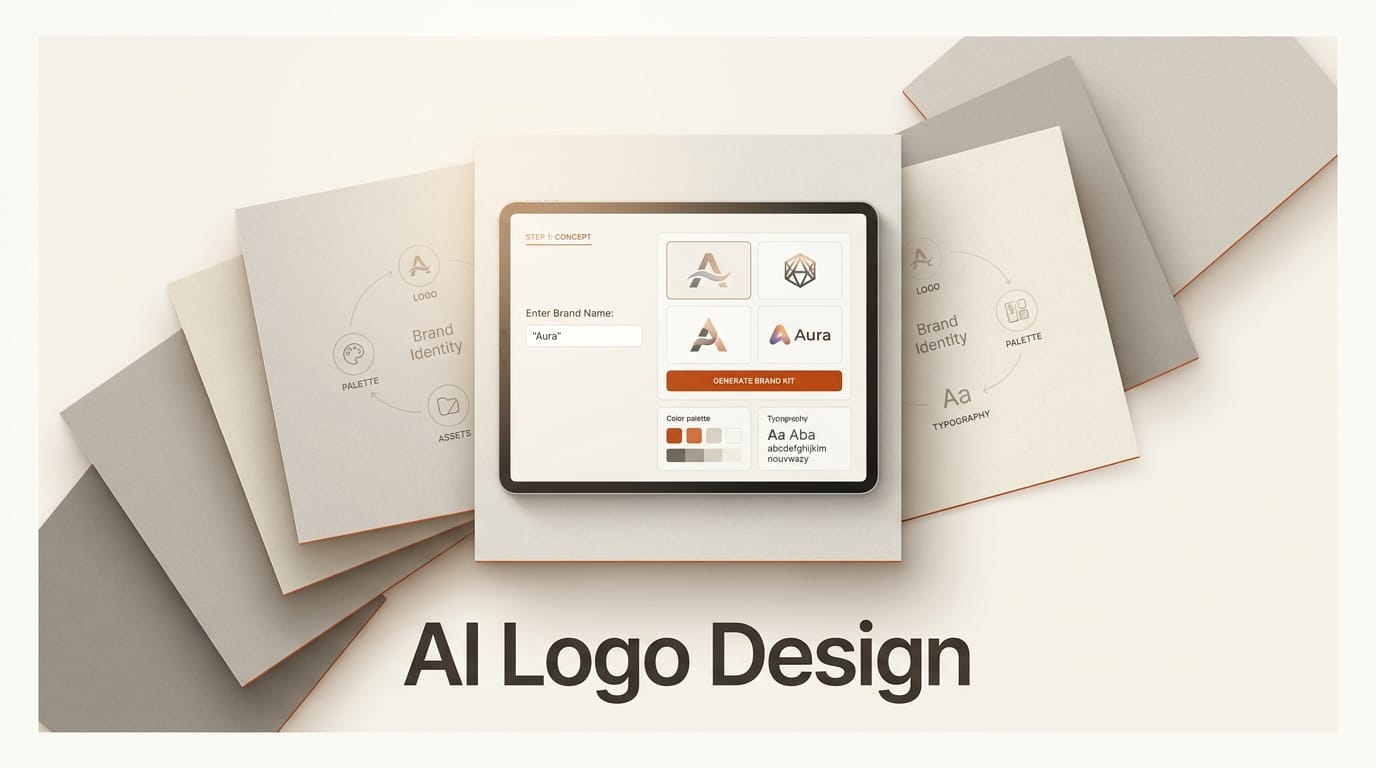
You can design a usable logo and a starter brand identity with AI in about an hour, without hiring a designer or opening complex vector software. The workflow below uses a text-capable image generator to create the mark, a vector tool to make it scalable, a background remover to clean it up, and free tools for type and color, so you finish with a logo, a color palette, and a font pairing you can actually ship. Total cost ranges from free to roughly the price of one month on a single paid image tool.
What You Need
Keep the toolkit small. You need one image generator that renders clean text and shapes, one way to turn that image into a scalable vector, and two free references for type and color.
- A text-capable AI image generator: Recraft for native vector and SVG output, Ideogram for the sharpest text rendering, or Adobe Firefly when you need commercially safe, indemnified output.
- A vector or brand-kit tool to assemble and export: Recraft exports SVG directly, while Looka and Canva turn a concept into a full brand kit.
- remove.bg to strip backgrounds and isolate the mark on transparency.
- Google Fonts for a free, commercially usable typeface, and Coolors to build and lock a color palette.
The AI Logo Workflow
Work in order. Each step feeds the next, and skipping the brief at the start is the most common reason AI logos come out generic.
Step 1: Write a one-line brand brief
Before you prompt anything, write a single sentence that names the brand, what it does, the feeling you want, and one visual cue to avoid clichés. Example: "Northwind, a cold-brew coffee brand, modern and calm, a simple wind or wave motif, no coffee-cup icon." That sentence becomes the backbone of every prompt. The clearer the brief, the less the generator falls back on the overused gradients and swooshes that make AI logos look AI-made.
Step 2: Generate the mark with a text-capable model
Prompt your image generator for the logo, not a scene. A reliable prompt shape is: "minimal vector logo for [brand], [motif], [style words], flat, two colors, solid background, centered, no photorealism." In Recraft, choose a vector or icon style so the output is built from clean shapes rather than a painterly raster. If your logo includes the brand name as text, Ideogram renders letterforms more reliably than most models, which matters because misspelled or warped type is the fastest way to kill a wordmark. Generate a batch of eight to twelve and shortlist three.
Step 3: Refine with variations, not restarts
Pick the strongest concept and iterate on it instead of rerolling from scratch. Use the tool's variation or remix feature to hold the shape and change one thing at a time: tighter geometry, a single accent color, more negative space. Two or three focused rounds beat twenty random generations, and they keep the mark coherent rather than drifting into a different idea each time.
Step 4: Vectorize and clean the mark
A logo has to work at both favicon and billboard size, which means it must be a vector. If you generated in Recraft, export the SVG directly. If you used a raster generator, run the image through a vectorizer or rebuild the shape in a vector tool, then pass it through remove.bg to isolate it on transparency. Save a full-color version, a solid-black version, and a solid-white version; you will need all three for different backgrounds.
Step 5: Pair a typeface and lock a palette
The mark is only part of a brand identity. Choose one display face for the logotype and headings and one clean face for body text from Google Fonts, keeping the pairing to two families at most. Then build a palette in Coolors: one primary color, one dark neutral for text, one light neutral for backgrounds, and at most one accent. Lock those hex values now so every future asset stays consistent.
Step 6: Assemble the starter brand kit
Collect the pieces into one place so the identity is reusable. Drop the logo variants, the two fonts, and the locked hex codes into a Canva brand kit or a Looka brand kit, or simply a single document. Add a one-line usage note: minimum clear space around the mark and the smallest size it stays legible. That kit is what keeps your social posts, thumbnails, and site from drifting apart over time.
Brand Rules That Make a Logo Work
AI removes the drawing barrier, not the judgment. A few rules separate a logo that ships from one that looks templated. Keep it legible at 16 pixels; if it turns to mush as a favicon, it is too detailed. Make it work in one flat color before you add any second color, because a mark that only reads in full color fails on stamps, embroidery, and dark mode. Use real negative space instead of stacking effects, and avoid gradients, drop shadows, and the generic swoosh that generators reach for by default. Finally, run a quick originality check by reverse-image-searching your mark so you do not accidentally ship something close to an existing brand.
Troubleshooting
If the text on your wordmark comes out garbled, switch to Ideogram or generate the icon and set the brand name in real type afterward rather than asking the model to render both. If every result looks like the same generic tech logo, your prompt is too vague; add the specific motif and the "avoid" cue from your brief. If the exported logo looks blurry when scaled, you are still working in raster, so vectorize it before doing anything else. And if you plan to use the logo commercially, confirm the tool's license: Adobe Firefly is trained for commercial safety and offers indemnification, which matters more for a logo than for a one-off image.
What to Try Next
Once the core identity exists, extend it. Generate a matching set of social avatars and cover images in the same palette, then build a thumbnail template so every video reinforces the brand; our guide on how to make YouTube thumbnails with AI plugs straight into this workflow. If your logo leans on typography, the comparison in the best AI image generator for text will help you pick the model that renders letterforms cleanly, and our roundup of the best AI image generators covers the broader field if you want to test more options before committing.
Can AI really design a professional logo?
AI can generate a strong logo concept in minutes, but the professional result comes from the workflow around it: a clear brief, vectorizing the mark so it scales, and pairing it with disciplined type and color. Treat the generator as a fast idea and drafting tool, then apply real design rules to finish it.
Which AI tool is best for logo text and lettering?
For rendering the brand name as clean text, Ideogram is currently the most reliable, while Recraft is strongest for scalable vector shapes. A common approach is to generate the icon in a vector tool and set the wordmark in a real typeface rather than asking one model to do both.
Do I get commercial rights to an AI-generated logo?
It depends on the tool. Adobe Firefly is built for commercial safety and offers indemnification, while other generators vary, so always check the license before using a logo commercially. Vectorizing and meaningfully editing the mark also strengthens your claim to a distinct final design.
Why does my AI logo look generic?
Generic output almost always traces back to a vague prompt. Without a specific motif and a cue for what to avoid, generators default to gradients, swooshes, and the same tech-startup look. Add the concrete visual idea from your brief and iterate on one concept instead of rerolling.
What files do I need to export?
Export the logo as an SVG vector for scalability, plus PNG versions with a transparent background in full color, solid black, and solid white. Those three color variants cover light backgrounds, dark backgrounds, and single-color uses like stamps or embroidery.